Brand development for pharmacy network
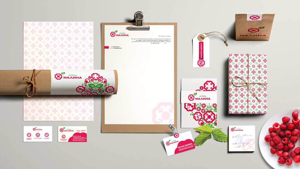
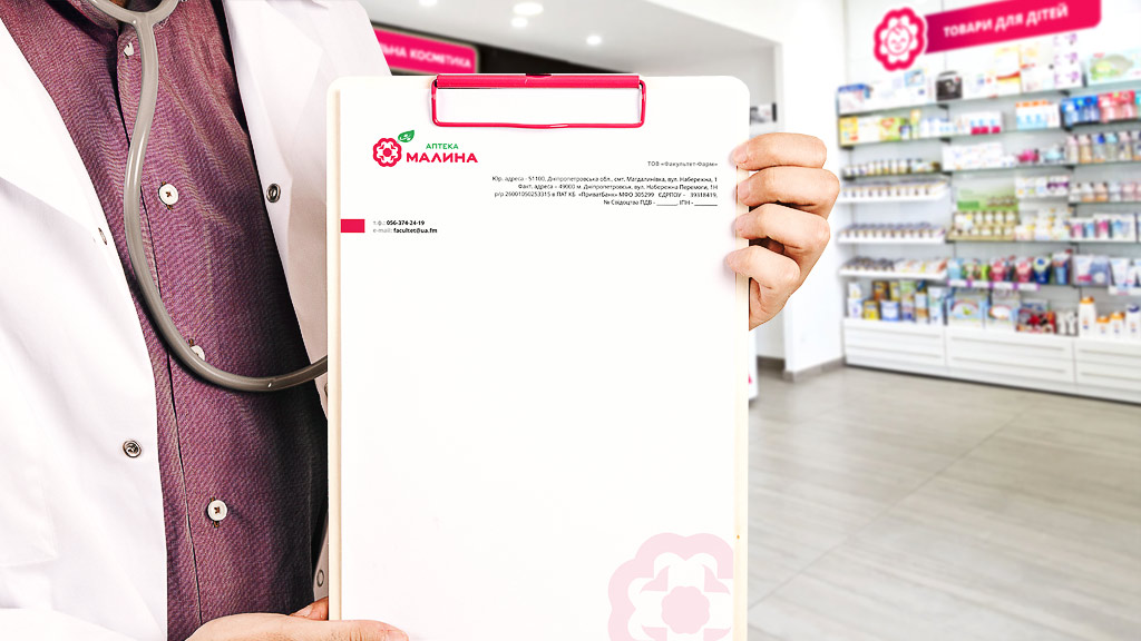
For the network of pharmacies with the new name “Malina”, our creative team developed an integrated brand design. Based on the proposed color solutions the corporate style was approved.
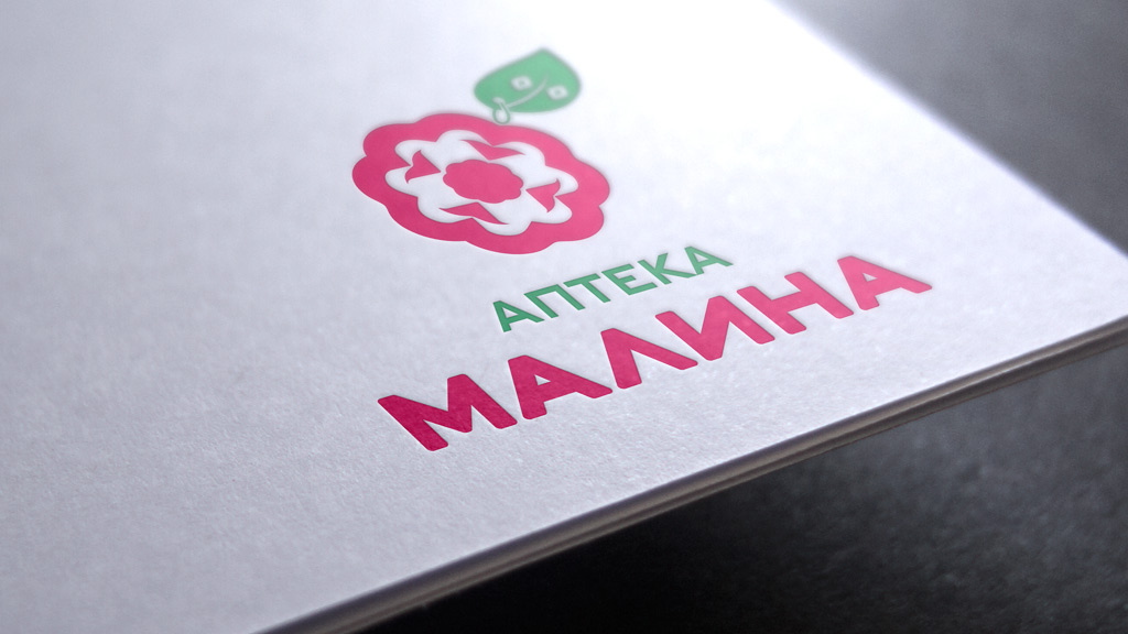
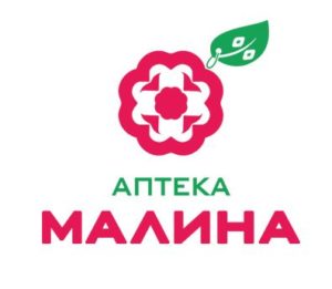
The “name” was the starting point in creating the logo. The graphic shape of the branded berry is created from a stylized initial letter M.
At the base of the sign is a berry view from above — a style-forming connotation in which the symbols inherent in the pharmacy are embedded — a cross, like two crossed medicinal capsules. The intersection of these symbols in the heart of Malinka forms a symbolic fragment in the style of the Ukrainian ornament.
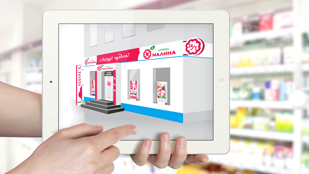
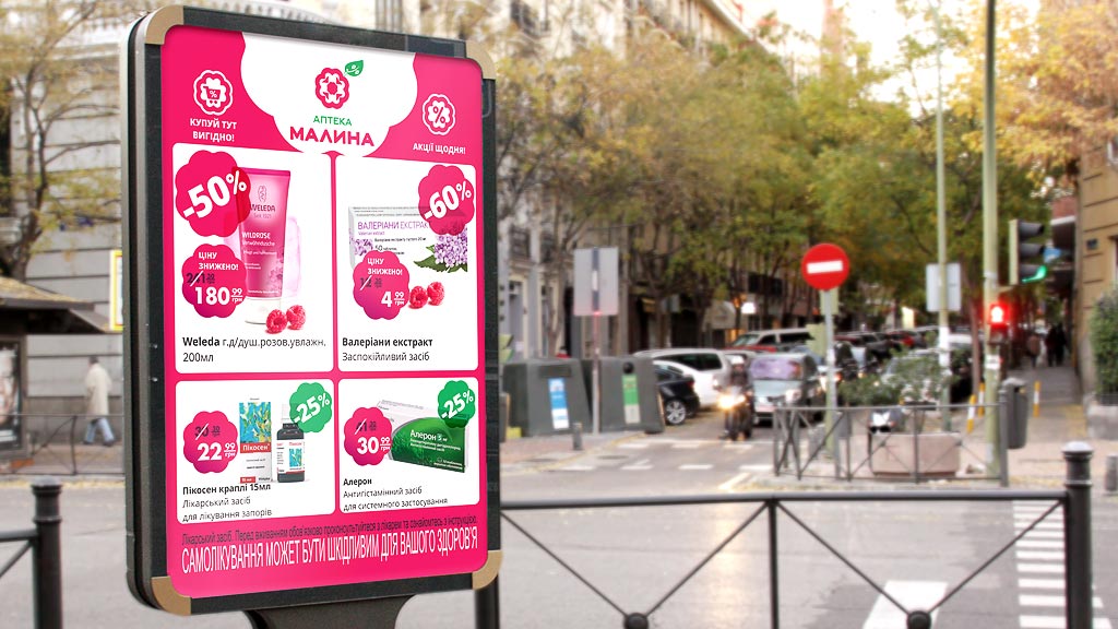
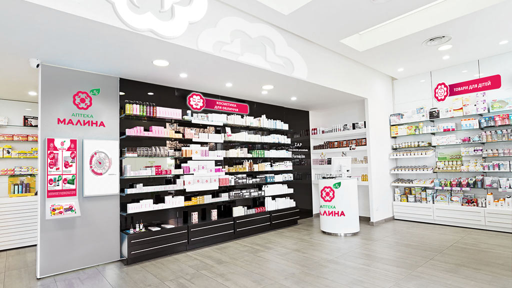
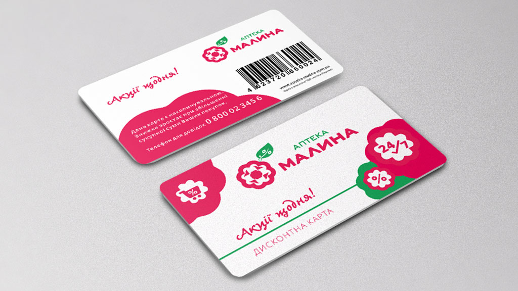
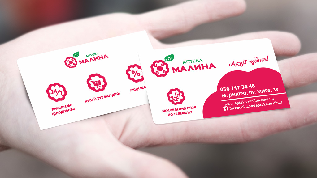
It has also been proposed and carried out a complex design of the facade. Pharmacy “Malina” has acquired a complete set of new design all the necessary POS-materials.